I recently presented a talk about missing data, discussing the different types of missing data and their appropriate solutions. As a modern man who understands that the posting never ends, I figured I could turn this talk into a series of blog posts. Resources discussing missing data often offer either brief overviews or incredible depth, but there are fewer resources out there that thread the needle between the two. My goal is to do that with this series.
It turns out that missing data is a rich field. There is far more to it than simply pretending you didn’t see it, like seeing a friend’s child misbehaving. It’s not my problem unless I make it my problem, right? Wrong. Unlike your friend’s child, there are consequences to not taking some responsibility for missing data. This series will make a case for taking missing data seriously. This first post will introduce the key concepts in this area, focusing on identifying missing data and its types. The second blog post will look at solutions to these missing data problems, illustrating the when’s and why’s of these solutions. Please enjoy my regurgitated data slop.
The data used as an illustration in this series is a synthetic employee attrition dataset taken from the modeldata package, created by the IBM Watson Analytics Lab. The dataset contains 1,470 observations and is picture-perfect, containing nothing but observations that wouldn’t dream of being missing. Instead, I will invoke missingness by replacing values with NAs.
Confessing My Sins
Missingness is a common problem in data, but it doesn’t receive the attention it deserves, and as a result, it often goes unaddressed in analyses. I have been guilty of this plenty of times in the past. I’m sure many of us have been.
It is easy to ignore missing data if you want to. Most statistical tools and programming languages have default mechanisms for dealing with NAs when encountered in the data, which is necessary because missing data is so common. Not having a method for resolving NAs would trip these tools up constantly. However, this produces unintended consequences. It makes it far too easy for the user to pass the buck and practice abstinence when it comes to missing data.
Missing data is the drawer in your fridge filled with soggy vegetables you hope someone else will deal with. Out of sight, out of mind. I’m just that insufferable productivity guy telling you that your chores won’t seem like such a big deal if you do them as soon as they come up. Dealing with missing data is choosing a healthy lifestyle. It’s your regular sleep schedule.
Missing Data Mechanisms
Rubin (1976) laid a lot of the groundwork for how we think about missing data today. He argued that all observations in a dataset have some likelihood of being missing, referring to this process as the missing data mechanism. He specifies three different mechanisms that cause missing data - missing completely at random (MCAR), missing at random (MAR), and missing not at random (MNAR). I think this terminology can be a little confusing. The difference between MCAR and MAR is not clear from their names. I would define these three categories as follows:
Missing Completely at Random (MCAR) – the probability of an observation being missing is the same for all cases, implying that the cause of missing values is unrelated to the data (Van Buuren 2018). MCAR data is not associated with other variables in the dataset and is uniformly random within-variable. In other words, it is completely random1.
Missing at Random (MAR) – the probability of an observation being missing is uniformly distributed within that variable, meaning that all potential values are equally as likely to be missing. However, missing data is associated with other variables in the data. The observed values of correlated variables could be used to predict missing values.
Missing Not at Random (MNAR) – the probability of an observation being missing is not random, and the mechanism that underpins missing values is unknown. Missing values follow a pattern, but that pattern is a function of unobserved data, whether it be the variable’s values themselves (for example, values over a certain threshold are all missing) or an unobserved variable.
For a more detailed explanation of the differences between MCAR, MAR, and MNAR data, I’d recommend the “Concepts of MCAR, MAR and MNAR” section of Van Buuren (2018)’s Flexible Imputation of Missing Data to help make sense of the differences2.
The plots below illustrate how the different missing data mechanisms might impact a variable’s distribution.
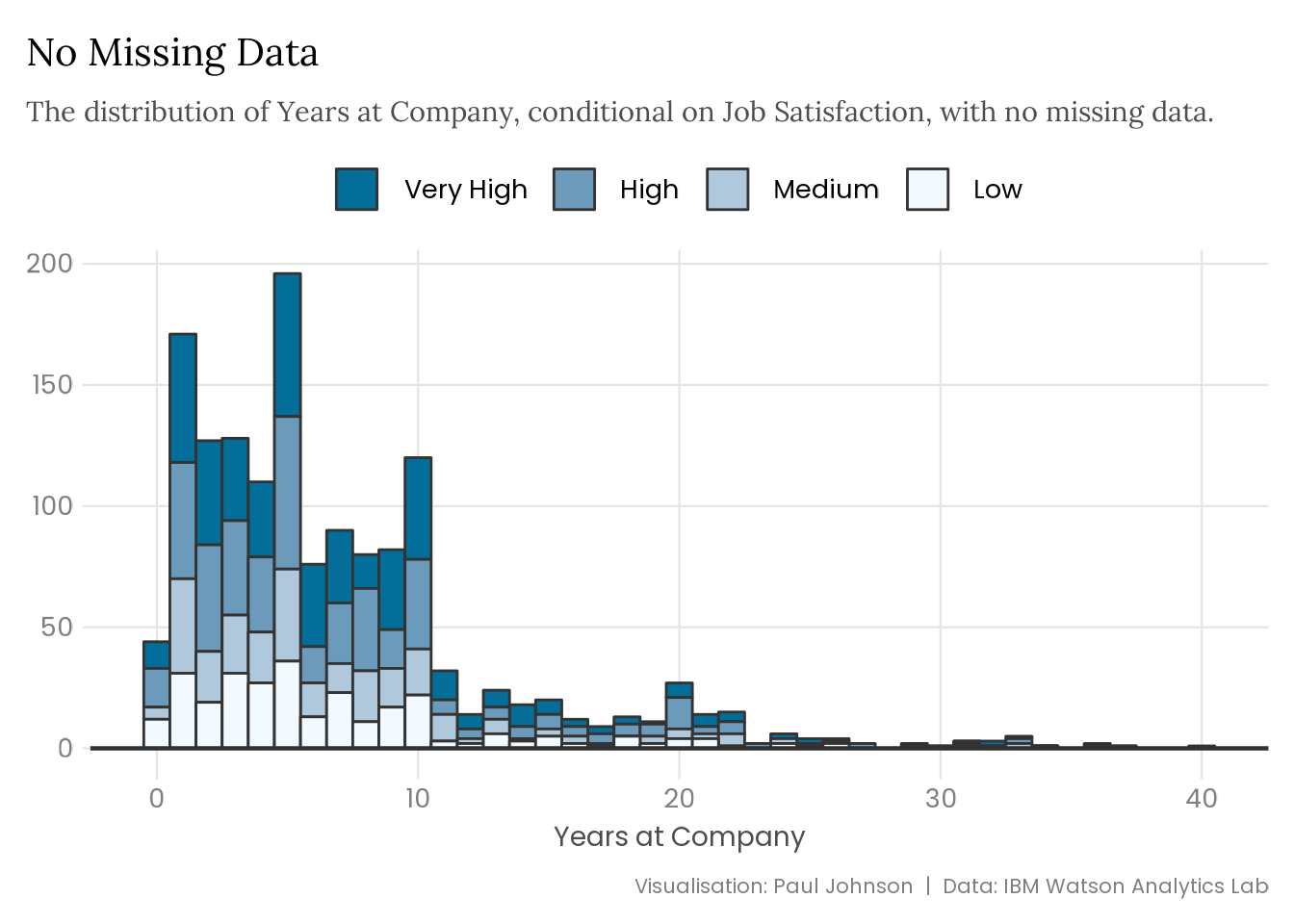
plot_satisfaction <-function(data) { data |>ggplot(aes(x = years_at_company,fill = forcats::fct_rev(job_satisfaction) )) +geom_histogram(binwidth =1, colour ="grey20") +geom_hline(yintercept =0, colour ="grey20", linewidth =0.8) +scale_fill_manual(values =c("#026E99", "#6C9ABA", "#B0C8DC", "#F2F9FF"),labels = snakecase::to_title_case ) +labs(x ="Years at Company",y =NULL,caption ="Visualisation: Paul Johnson | Data: IBM Watson Analytics Lab" ) }attrition |>plot_satisfaction() +labs(title ="No Missing Data",subtitle = stringr::str_wrap( glue::glue("The distribution of Years at Company, conditional on Job Satisfaction, ","with no missing data." ),width =95 ) )
Plot Code (Click to Expand)
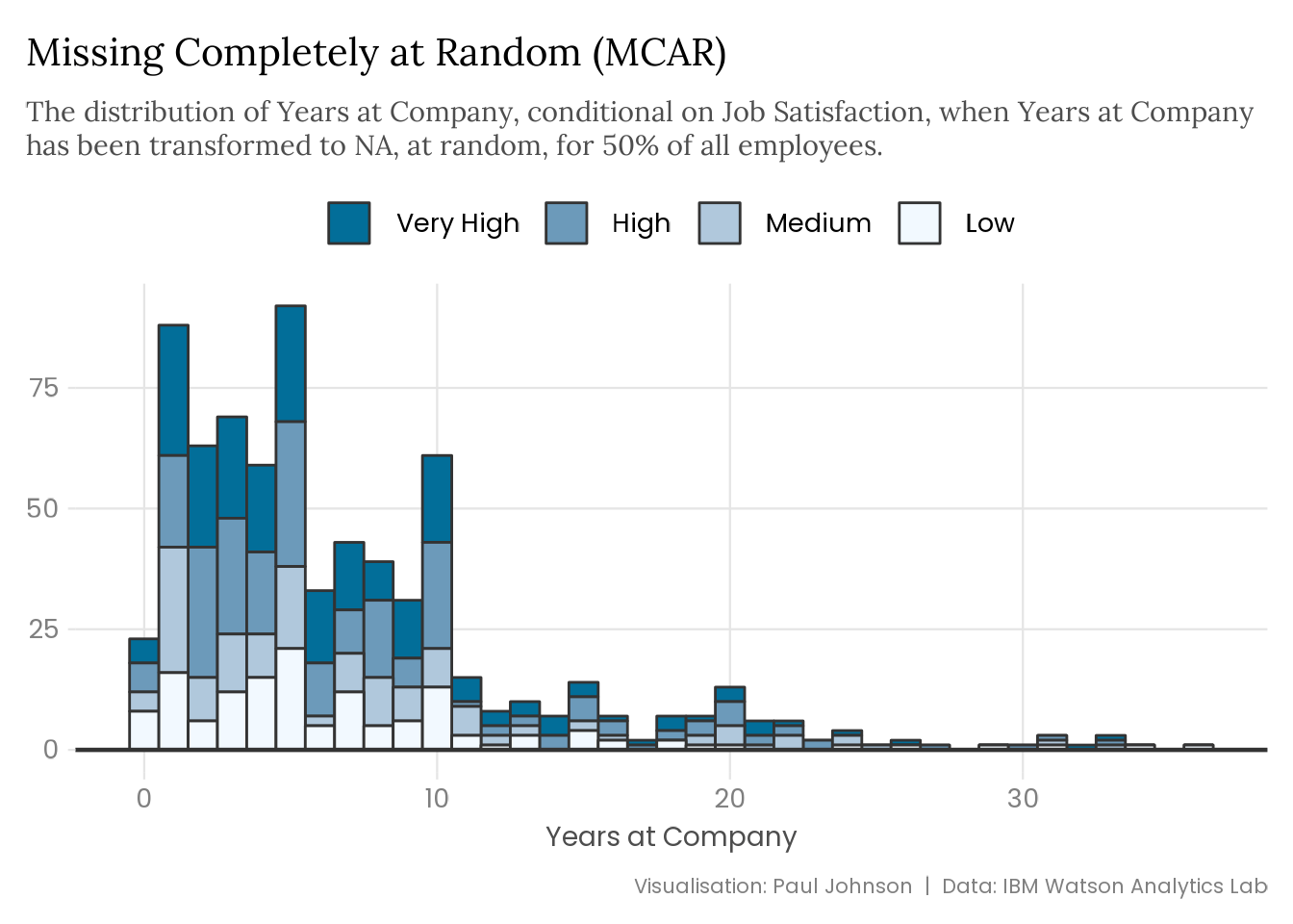
set.seed(123)attrition |>mutate(years_at_company =replace( years_at_company,runif(n()) <0.5,NA ) ) |>plot_satisfaction() +labs(title ="Missing Completely at Random (MCAR)",subtitle = stringr::str_wrap( glue::glue("The distribution of Years at Company, conditional on Job Satisfaction, ","when Years at Company has been transformed to NA, at random, for 50% ","of all employees." ),width =95 ) )
Plot Code (Click to Expand)
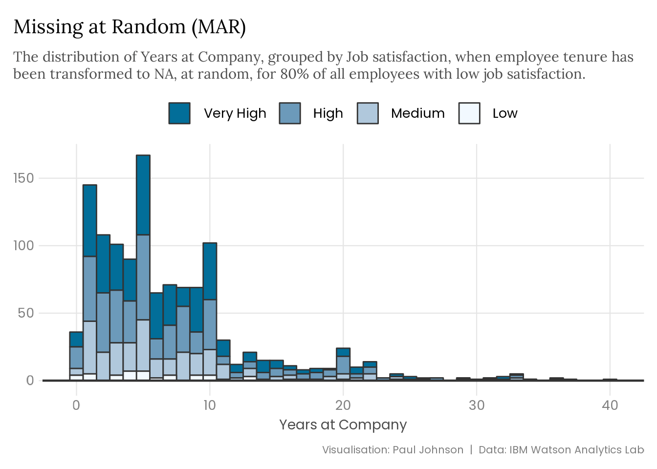
set.seed(123)attrition |>mutate(years_at_company =replace( years_at_company,runif(n()) <0.8& job_satisfaction =="Low",NA ) ) |>plot_satisfaction() +labs(title ="Missing at Random (MAR)",subtitle = stringr::str_wrap( glue::glue("The distribution of Years at Company, grouped by Job satisfaction, ","when employee tenure has been transformed to NA, at random, for ","80% of all employees with low job satisfaction." ),width =95 ) )
Plot Code (Click to Expand)
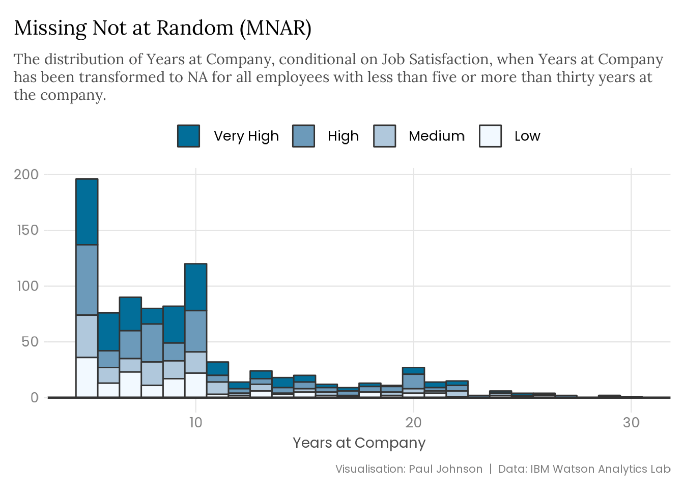
attrition |>mutate(years_at_company =replace( years_at_company,!between(years_at_company, 5, 30),NA ) ) |>plot_satisfaction() +labs(title ="Missing Not at Random (MNAR)",subtitle = stringr::str_wrap( glue::glue("The distribution of Years at Company, conditional on Job Satisfaction, ","when Years at Company has been transformed to NA for all employees ","with less than five or more than thirty years at the company." ),width =95 ) )
The type of missing data you’re dealing with can significantly impact a variable’s distribution and bias your precious estimates. The extent of the problem depends on the missing data mechanism and the amount of missingness. Data that is MCAR provides more flexibility than data that is MAR. If you catch wind of MNAR data, you are in real trouble.
Diagnosing Mechanisms
Finding missing data is the first step, but understanding why it is missing matters most. I recognise I’m arguing in favour of creating more work for yourself, but there is good news - it is also hard to identify the missing data mechanism. The mechanism will not be explicitly detailed as it has been for the plots in Section 2. In the wild, you can’t observe the missing values or the population distribution for comparison, so you won’t be able to identify the source of your missing values conclusively.
To make matters worse, it is not possible to conclusively define the missing data mechanism because you cannot observe the missing values or the population distribution the observed values came from. It’s not that I’m saying it is guesswork. But I’m not not saying that it’s guesswork…3
Exploring Missing Data
There are lots of good resources for learning how to effectively diagnose the missing data mechanism, so in the interest of not turning this blog post into a tome, I won’t go into incredible detail about this process. Tierney and Horst (2022)’s The Missing Book is fantastic for learning about the missing data exploratory analysis workflow using the R package naniar4. The mice and ggmice R packages offer additional functionality for investigating missingess5. Instead of detailing an entire exploratory workflow, I will give a brief overview, with example plots6. While not exhaustive, it will hopefully serve as inspiration to get you started.
I’ve transformed the attrition dataset to include missing data spread across multiple variables. Most missing data is MCAR, but the years an employee has spent at the company is MAR. Missing values for employee tenure are associated with low job satisfaction and high monthly income (greater than $15k per month).
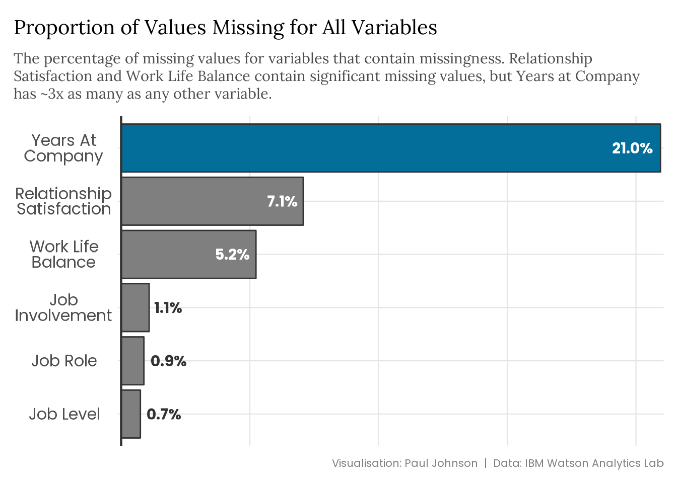
The starting point in any exploratory analysis of missing data is to get some idea of the quantity of missingness and where it is. The plot below7 summarises the missingness in the attrition dataset.
Plot Code (Click to Expand)
missing_years |>summarise(across(everything(), ~sum(is.na(.x)) /n())) |> tidyr::pivot_longer(cols =everything(),names_to ="variable",values_to ="value" ) |>filter(value !=0) |>mutate(variable = stringr::str_to_title( stringr::str_replace_all(variable, "_", " ") ),variable = forcats::fct_reorder(variable, -value, .desc =TRUE) ) |>ggplot(aes(x = variable, y = value)) +geom_col(aes(fill =as.numeric(variable) ==6), colour ="grey20") +geom_text(aes(label =paste0(sprintf("%2.1f", value *100), "%"),colour = value > .03,hjust =if_else(value > .03, 1.2, -.2) ),size =8,fontface ="bold",family ="Poppins" ) +geom_hline(yintercept =0, colour ="grey20", linewidth =0.8) +coord_flip() +scale_x_discrete(name =NULL,labels = scales::label_wrap(15) ) +scale_y_continuous(guide ="none", name =NULL, expand =c(1e-03, 1e-03)) +scale_fill_manual(values =c("grey50", "#026E99"), guide ="none") +scale_colour_manual(values =c("grey20", "white"), guide ="none") +labs(title ="Proportion of Values Missing for All Variables",subtitle = stringr::str_wrap( glue::glue("The percentage of missing values for variables that contain ","missingness. Relationship Satisfaction and Work Life Balance contain ","significant missing values, but Years at Company has ~3x as many as ","any other variable." ),width =93 ),caption ="Visualisation: Paul Johnson | Data: IBM Watson Analytics Lab" ) +theme(plot.subtitle =element_text(margin =margin(5, 0, 10, 0)),axis.text.y =element_text(colour ="grey30",size =rel(1.2),hjust =0.5,margin =margin(0, 0.5, 0, 0.5),lineheight = .4 ),axis.ticks =element_blank() )
Having already detailed what I did when adding missingness to the data, I feel a little silly not just visualising this but now describing the results. It turns out that there are a bunch of missing values spread across six variables, but the biggest culprit is an employee’s tenure at the company. Astonishing. Whoever could have predicted this?
A rigorous analysis would look at each variable and diagnose the mechanism driving the missingness. Given I’m the underlying cause for all missing values, we will take the shortcut and focus on employee tenure.
Assume MAR; Test MNAR/MCAR
Generally speaking, MCAR data is rare. Missing values can occur for many reasons, and the likelihood that the cause is independent of all other variables is low.
It is more plausible that the data is either MAR or MNAR (Nahhas 2024). However, dealing with MNAR data is particularly complicated8. It is reasonable to assume your data is MAR until you find enough evidence to suggest otherwise (in either direction).
In practice, identifying the type of missingness you’re dealing with requires exploratory analysis, domain expertise, and good judgment. Testing the assumption that your data is not MNAR involves exploring missing values and looking for evidence that missingness may not be random. For example, observed values may be constrained at a value lower than your expertise suggests should be the maximum, indicating some censoring of the variable. Simple summary functions and plotting distributions can uncover evidence that missing values are non-random. However, concluding that data is MNAR requires domain expertise and a good understanding of your data.
It is a little easier to test the assumption data is not MCAR because any association between observed and missing values acts as evidence data is MAR. One way to look for associations is to create a binary variable that represents a variable’s missingness using naniar::bind_shadow() and plotting the distribution of other variables conditional on missingness. Spikes in the distribution of missing values, relative to the distribution of observed values, indicate a correlation between that variable and the missing values.
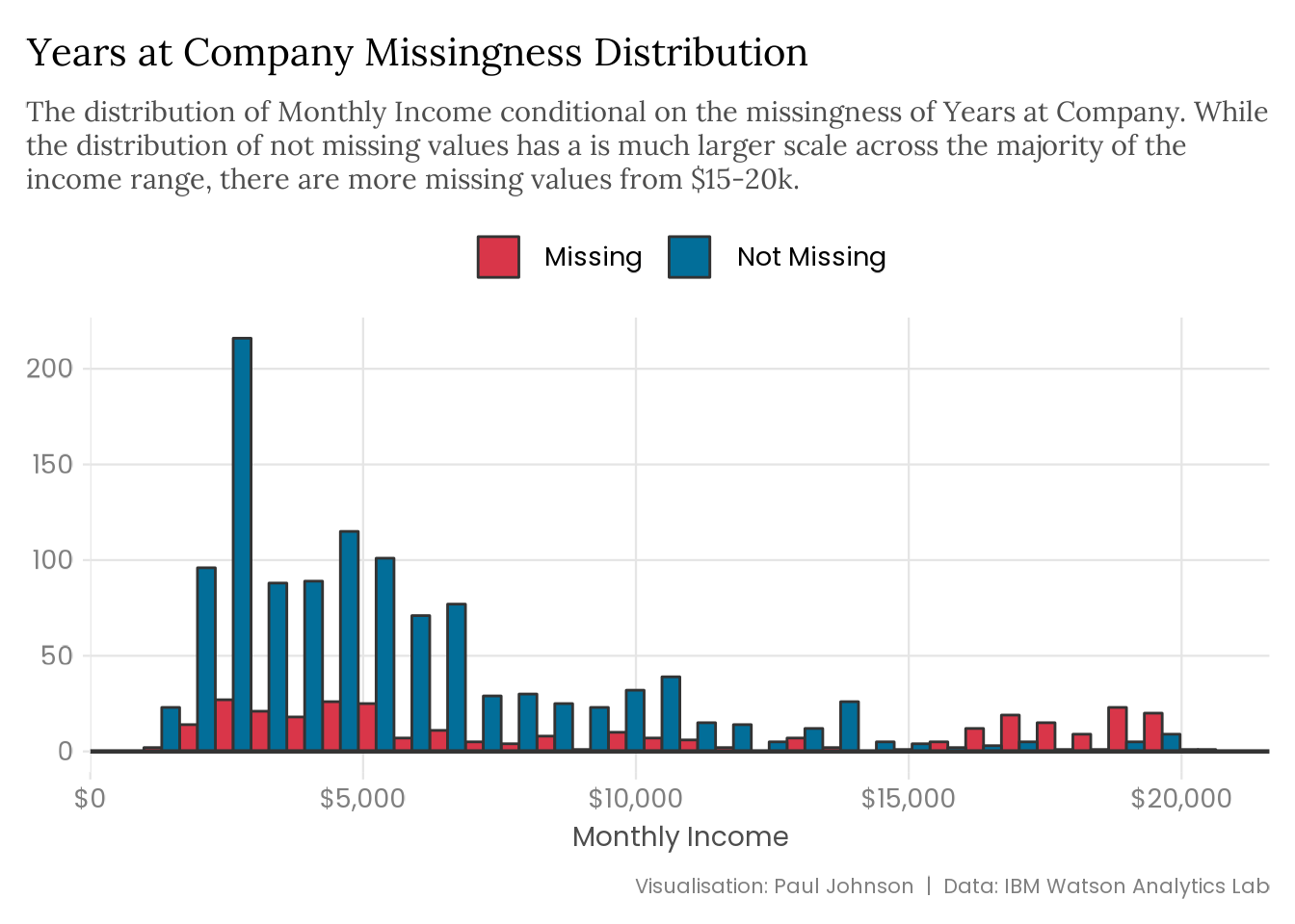
The plot below visualises the monthly income distribution, conditional on employee tenure’s missingness. A thorough analysis would require digging to find associations, but I’m cheating and already know where to look.
Plot Code (Click to Expand)
missing_years |> naniar::bind_shadow() |>ggplot(aes(x = monthly_income,fill = forcats::fct_rev(years_at_company_NA) )) +geom_histogram(position ="dodge", colour ="grey20") +geom_hline(yintercept =0, colour ="grey20", linewidth =0.8) +scale_fill_manual(labels =c("Missing", "Not Missing"),values =c("#D93649", "#026E99") ) +scale_x_continuous(labels = scales::label_currency()) +labs(title ="Years at Company Missingness Distribution",subtitle = stringr::str_wrap( glue::glue("The distribution of Monthly Income conditional on the missingness of ","Years at Company. While the distribution of not missing values has a ","is much larger scale across the majority of the income range, ","there are more missing values from $15-20k." ),width =95 ),x ="Monthly Income",y =NULL,caption ="Visualisation: Paul Johnson | Data: IBM Watson Analytics Lab" )
We expect the missing data distribution to follow a similar pattern to the observed values if it is MCAR. That is more or less the case for the monthly income distribution, but there is a spike at the higher end from around $15-20k. That suggests we might be dealing with MAR data.
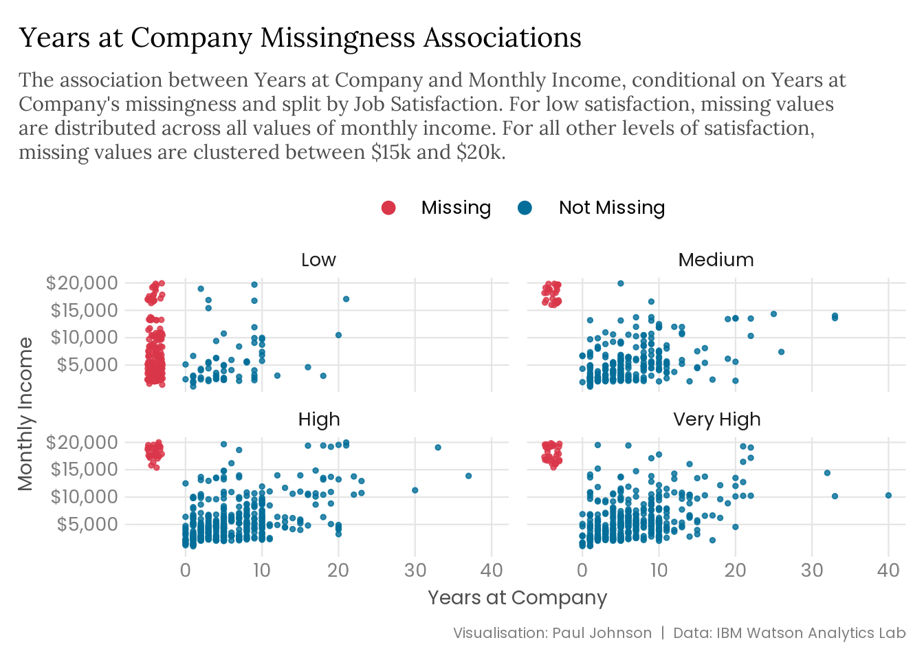
We can also use naniar::geom_miss_point() to plot the association between employee tenure and income, and we can facet the data into separate plots for each level of job satisfaction (since we already know that job satisfaction is associated with tenure missingness).
Plot Code (Click to Expand)
missing_years |>ggplot(aes(x = years_at_company, y = monthly_income)) + naniar::geom_miss_point(size =1, alpha =0.8) +facet_wrap(vars(job_satisfaction)) +scale_colour_manual(values =c("#D93649", "#026E99")) +scale_y_continuous(labels = scales::label_currency()) +guides(colour =guide_legend(override.aes =list(size =3))) +labs(title ="Years at Company Missingness Associations",subtitle = stringr::str_wrap( glue::glue("The association between Years at Company and Monthly Income, ","conditional on Years at Company's missingness and split by Job ","Satisfaction. For low satisfaction, missing values are distributed ","across all values of monthly income. For all other levels of ","satisfaction, missing values are clustered between $15k and $20k." ),width =92 ),x ="Years at Company",y ="Monthly Income",caption ="Visualisation: Paul Johnson | Data: IBM Watson Analytics Lab" )
While the income distribution indicated that employee tenure might contain missing values that are not MCAR, the above scatter plots provide strong evidence we’re dealing with MAR data. The scatter plots show that missing values are limited to the $15-20k monthly income range, except when job satisfaction is low, where missingness exists across all incomes. The fact that missing values group around specific ranges of observed values indicates that employee tenure’s missing values are not randomly distributed and suggests a relationship between these missing values and monthly income and job satisfaction. These results provide strong evidence that the missingness in the employee tenure variable is not MCAR.
It is also possible to compute statistical tests of the association between missing values and the observed values in the data. One option is to model missing values using logistic regression, treating missingness as the binary outcome (using naniar::bind_shadow() as before) and the rest of the dataset as explanatory variables. Table 1 shows the outputs from a regression on employee tenure’s missing values. I have rescaled monthly income (and monthly rate) using arm::rescale()9 because it is on a significantly larger scale than other variables, and this makes it difficult to interpret the effect size.
Table 1: Logistic Regression of Years at Company’s Missing Values
Years at Company Missingness
Distance from Home
0.971*
(0.013)
Job Satisfaction
0.097***
(0.015)
Monthly Income
52.938***
(37.810)
Monthly Rate
0.658*
(0.139)
Total Working Years
1.050+
(0.029)
Num.Obs.
1261
RMSE
0.27
+ p < 0.1, * p < 0.05, ** p < 0.01, *** p < 0.001
Source: IBM Watson Analytics Lab
I have only included statistically significant variables10. While this is generally a bad practice, regression tables with 31 variables look like a mess in the middle of a blog post. A narrow focus on p-values is a bad idea in any regression model because effect size tells us a lot more than significance, but in this case, we’re taking some shortcuts. The extremely small p-values for monthly income and job satisfaction indicate that the probability of observing an effect size at least as extreme as our model coefficients if the data was MCAR is small11. These results support our assumption that the data is MAR.
Another option is to use naniar’s mcar_test() to calculate Little (1988)’s test statistic for MCAR data12. Table 2 shows the results of running Little’s MCAR test on our dataset.
A high test statistic value and a p-value of zero means we reject the null hypothesis. If the data is MCAR, the probability of observing mean differences as or more extreme than this is very low, suggesting the missing data is either MNAR or MAR. However, there are several limitations to Little’s MCAR test. First, it tests all missing data across the entire dataset instead of testing specific missing patterns. Running logistic regressions on specific missingness is a lot more granular and can be more informative. Second, Little’s MCAR test relies on a slightly backwards approach to hypothesis testing. The null hypothesis is that the data is MCAR. Failing to reject the null is not the same as being able to conclude that the null is true, so it isn’t a test for MCAR data as much as it is a test to reject the hypothesis that the data is MCAR. I’d argue this is fine because the starting assumption is that data is MAR. Little’s MCAR test provides a broad summary of the data. A high p-value suggests further investigation is needed because data might not be MAR, and a low p-value is evidence to support the assumption that the data is MAR. However, I think logistic regressions are more informative, robust, and equally easy to compute, so I would recommend this approach instead.
Finally, another approach to identifying associations between missingness and observed values, which makes fewer assumptions of the data than either modelling approach, is calculating the mean difference of variables conditional on the missingness of the variable in question.
Ultimately, there are no shortcuts in this process. Whichever approach you take, it can only provide supporting evidence, not confirmation. A detailed exploratory analysis combined with domain expertise is the only way to understand how the data may have come to be missing.
Well, What Now?
There you have it. You now know everything you need to know about missing values. That’s a lie. You know nothing. It’s a vast, overwhelming field full of anguish. All I’ve done is expose you to its existence. Now you will never escape the shame of being flippant about missing data. You’re welcome.
Missing data can have multiple causes, and the mechanism driving missingness can have distinct impacts on data distributions. MNAR and MAR data can seriously bias estimates, while MCAR data is less concerning. For this reason, it is important to understand what is causing missing data. Having (hopefully) convinced you to care about missing data and given you some of the tools needed for identifying its mechanism, the next step is figuring out what to do with it. In the next post in this series, I will discuss solutions to the mess you’ve made found.
Acknowledegments
Many thanks to Camilo Alvarez (of the great Trivote Discord fame) for his kind but constructive feedback during the development of this series of blog posts. I greatly appreciate anyone who helps me be just a little less stupid.
Preview image generated using StabilityAI’s DreamStudio, using the prompt “A red milk carton with a missing persons advert on the side of the carton, but instead of a person it is data that is missing”.
Gelman, Andrew. 2008. “Scaling Regression Inputs by Dividing by Two Standard Deviations.”Statistics in Medicine 27 (15): 2865–73.
Little, Roderick JA. 1988. “A Test of Missing Completely at Random for Multivariate Data with Missing Values.”Journal of the American Statistical Association 83 (404): 1198–202.
However, as Tierney and Horst (2022) noted, data missing completely at random does not mean values are missing for no reason. Something must have caused the missingness, but the missingness is uniformly distributed and unrelated to observed values.↩︎
I would also recommend the “Concepts in Incomplete Data” section of his book if you are looking for more precise definitions of MCAR, MAR, and MNAR data.↩︎
I am, in fact, not saying that you should be guessing the missing data mechanism. Making evidence-based deductions is not guessing. It’s just uncertain and noisy.↩︎
Some plots didn’t use the listed packages but can be easily reproduced using functions from those packages. They won’t be as aesthetically pleasing, but that doesn’t matter for exploratory purposes (it only matters for my silly little blog).↩︎
Created with the help of Cédric Scherer’s (2021, 2023) excellent guidance on labelling bar plots.↩︎
It requires specifying a missing data model and doing difficult things like sensitivity analysis (Van Buuren 2018; Nahhas 2024).↩︎
This rescale function standardises variables by centring and dividing their values by two standard deviations (Gelman 2008).↩︎
I used coef_omit = c(-7, -16, -18, -19, -26) in modelsummary to do this because I couldn’t figure out a programmatic way of omitting by significance. If anyone has any idea of a non-manual way to achieve this, I’d love to hear it! I promise I won’t do it on proper regression models.↩︎
The other significant coefficients will be an artefact of those variables’ association with monthly income and job satisfaction.↩︎
Little (1988)’s MCAR test tests for mean differences on all variables in the dataset, split by subgroups that share the same missing data pattern. Subgroup observed means are compared against expected means, calculated using the expectation-maximisation algorithm, and this difference forms the basis of the test. The null hypothesis is that the data is MCAR, and the computed test statistic is a chi-squared value.↩︎